-
Level:
Scoolinar
@sussan_scoolinaryteam
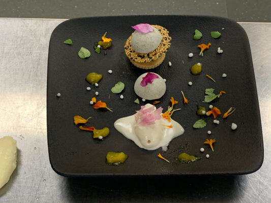
Improve my dessert plate up. 😁 From a few months ago. I forgot all about it.
The melting bit at the front is a vanilla icecream. The speckled cold element is a black sesame pannacotta. You can’t see it, under the sesame tuille is another half dome of the pannacotta. I was going for a space theme on this plate, that’s a pannacotta planet. 🤣
There’s white caviar pearls, as stars. The colour is because it needed colour. 😁
I know it’s too much on the plate, but I never know what to leave off. 🙄
Jigna Shah, Orsolya Csernák and 3 others7 Comments-
Level:
Scoolinary Team
I can see the planet theme there, my friend. If that’s the main challenge, I would say it’s covered. Let’s wait for Sussan’s opinion.
Any other Scoolinar may suggest how to improve this dish to our friend Cary?1 -
Level:
Scoolinary Team
Hi Cary
Your dish has a creative concept and an interesting presentation!
Here are some suggestions you might consider to enhance both the plating and the photography:
Plating:
Simplification: As you mentioned, there are a lot of elements on the plate. Try reducing the number of components so the main elements stand out more. Perhaps focus on highlighting the pannacotta and vanilla ice cream with fewer decorations around them.
Contrasting Colors: Although the space theme is very creative, you could work more on color contrasts to make each element visually impactful. The flower petals and white caviar pearls work well, but you might consider using a lighter background plate so the darker elements (like the pannacotta) stand out more.
Organization and Balance: You can try grouping the elements in a more cohesive way, avoiding a scattered look. This will help guide the diner’s eyes toward the key components of the dish.
Photography:
Lighting: Lighting is crucial in food photography. In the image, the lighting seems a bit dim, which gives a dull tone. Try using a natural light source or soft light to bring out the colors in the dish.
Camera Angle: The overhead angle works well to show all the elements, but you could experiment with lower angles to add depth and highlight the texture of the components.
Background and Context: The metallic background reflects a kitchen environment, but you might consider a background that complements the dish and reinforces the space theme. Something darker or more neutral could work well.
Selective Focus: You could play with depth of field, focusing more on the main elements like the pannacotta and ice cream, leaving the rest slightly blurred to give a more professional effect.
Making these adjustments can enhance the visual appeal and make your dish look even more attractive and refined. Keep experimenting!
Best regards.
1-
Level:
Scoolinar
@Sussan ScoolinaryTeam Excellent, thank you Sussan.
I went for the darker plate to represent the darkness of space. 😁
-
Level:
Scoolinary Team
Great! We hope the advice provided is helpful, and if you have any other questions or concerns, I’m here and ready to assist you.
Best regards.
-
-
-
Level:
Scoolinar
I think it’s a lovely theme and it works with the components of the dish, but the plating lacks a focal point. I’d want to see more negative space and a stronger arrangement to draw focus to the trio of desserts. That said, I appreciate that it reminds me of a Space Invaders style video game!
-
Level:
Scoolinar
You are so creative, Cary 🙂 I love this!!! or… I would love this… 🙂
1-
Level:
Scoolinar
@Orsolya Csernák Okay….hold on….let me get my stuff, I’ll be there for dinner in two days. 🤣🤣🤣
-
-


